Most web projects started with conversations. Typically, I collected requirements, images, and inspirational ideas by interacting with clients and potential site user. Often during these field interviews some of the smallest details became critically important when a site was developed.
U.S. Army Diversity Office
Website design 2010
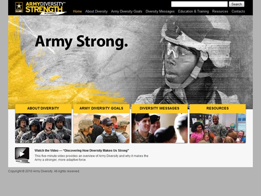
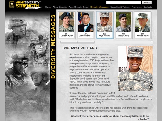
I built the website for the U.S. Army Diversity Office (ADO) from text and images taken from the client’s PDF brochures. The site included a video on the homepage, and jQuery overlays on the ‘Diversity Messages’ page.
View the U.S. Army Diversity Office website
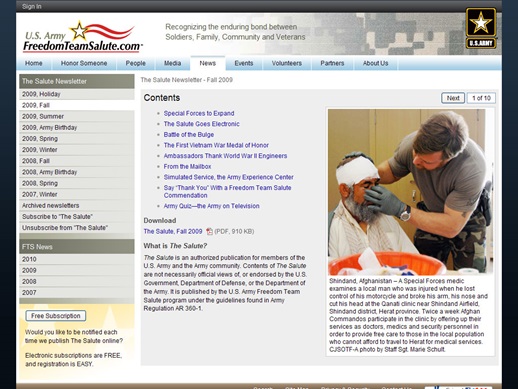
U.S. Army Freedom Team Salute
Website redesign and content maintenance 2008–2010
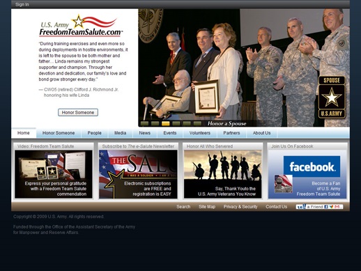
I redesigned the Freedom Team Salute website in 2008, and updated the content daily until 2010. The site featured positive news about soldiers, veterans, and the communities that support our military.
United Equity
Website design 2003–2005
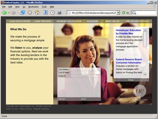
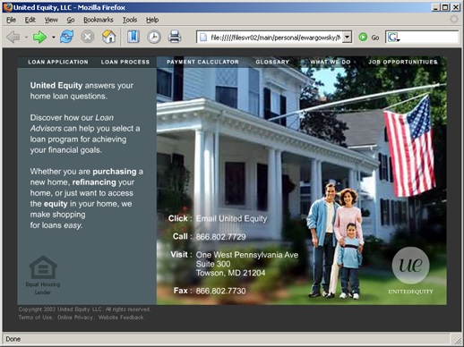
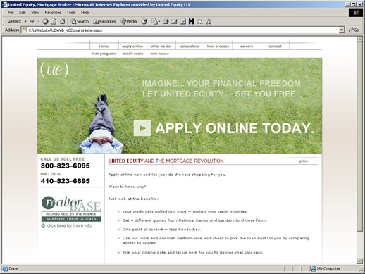
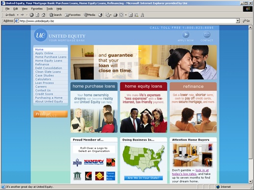
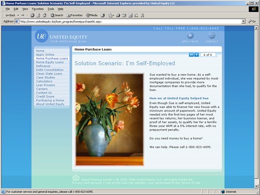
Working with a small IT group at a startup mortgage company, we quickly built and frequently updated the company website. In addition, the team built several unique software tools for tracking the mortgage process from marketing campaigns, client contacts, client paperwork, all the way to closing.
I built the first version of United Equity’s website in 2-weeks using Adobe Flash.

Tha Corporation
Website design 2003
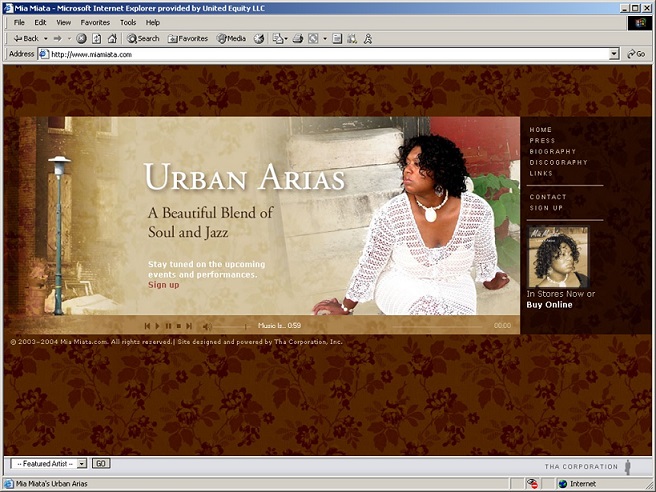
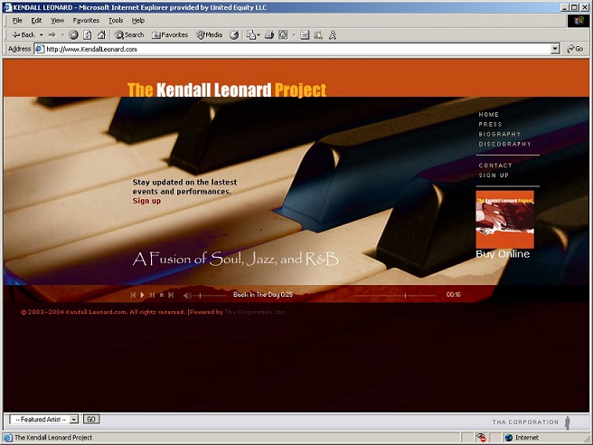
For a good friend, I designed websites for several music artists. The themes for the websites came from the CD artwork. Before the working on the web projects, I collaborated with graphic artists to create the the CD covers and the liner notes.
FedEx
E-learning course design 1998
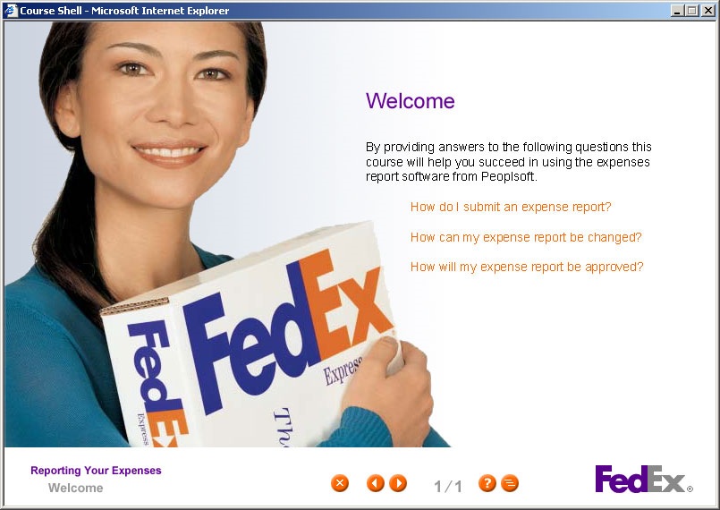
I designed the course architecture and webpage templates for a FedEx e-leaning course, “Reporting Your Expenses.” Working closely with the graphics team at FedEx I was able to select images with a warm and friendly feeling that supported the company’s branding. In addition, I used software built my company, RWD Technologies, to quickly create help documents, and software simulations that where linked to the course. RWD’s training methodology was, “Tell me, Show me, Let me try.”
