For me, designing an application is like writing a movie script with alternative story-lines. Actions and dialogs are described in wireframe mockups, and while developing the content a “voice” and a “personality” is crafted for the application. The last step is to set a mood by creating a theme with images and color.
CaseView
Application redesign 2012 – 2017
The U.S. Attorney Offices use CaseView to track cases from initiation to final disposition. CaseView replaced a legacy, form based, interface with a new web-based interface. This was large project, and throughout developed processes, new features and enhancements where continuously added.
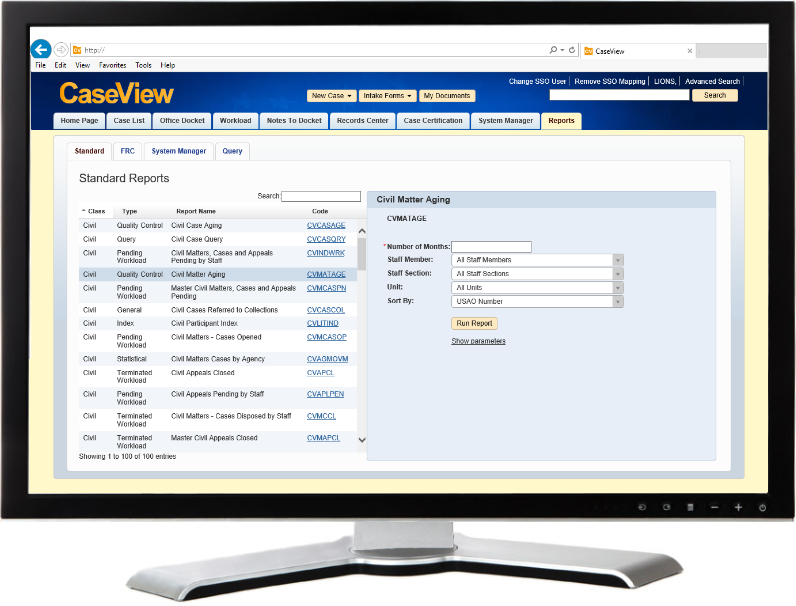
Small sample of CaseView 2.9 wireframes
- Update to CaseView advanced search (PDF 1 MB)
- Update to the CaseView system administrator screen (PDF 882 KB)
- Update to the CaseView team manager screens & report (PDF 961 KB)
QuadraMed Affinity
Toolbar redesign 2007
Redesigning the toolbars was a small part of a larger effort to improve consistency in all of QuadraMed’s applications. The new toolbars where very noticeable, and set the stage for the great user acceptance of the big changes that followed.
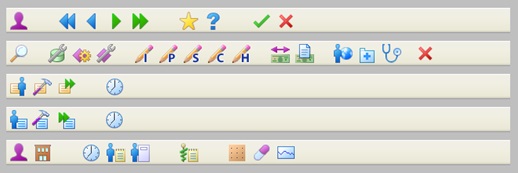
QuadraMed Affinity
User interface guidelines 2007
The challenge was to standardize many software applications, written in different programming languages, and developed by separate groups over many year into a single suite of products with a similar look and feel.
Draft QuadrMed user-interface guidelines (PDF 457 KB)
Member Regulation Surveillance System
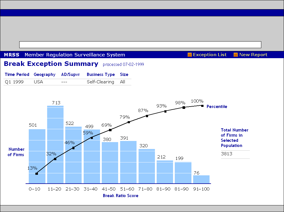
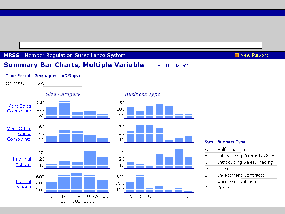
Data visualization (charts and graphs) 1999
The National Association of Securities Dealers (NASD) Regulations use the Member Regulation Surveillance System (MRSS) to assist in regulating companies within the securities industry.
Before MRSS was created, regulators used desktop adding machines to analyzed company data from printed spreadsheets.
In the first phase of the project, MRSS provided users with the data online. In the second phase, MRSS performed computations and data analysis in the background, and then presented the results to the users in a series of easy to read charts and graphs. My role on the project was to design the charts and graphs.
